Nov 162009
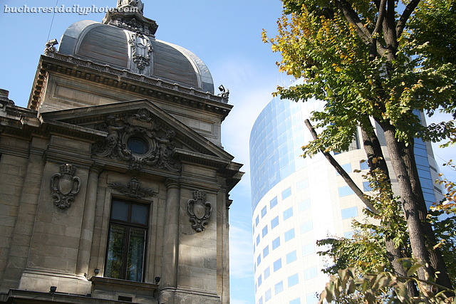
I’ve talked about the contrast shown in today’s photo in on older post, the old bank rubbing elbows with the new business center (a former bank), but the picture was taken from afar and I thought it would be nice to show you a close-up as well.

Striking and more effective than in the other photo, where the effect was somewhat diluted. Personally, I like these contrast, this one included.
I really like that contrast. I wonder what has become of the old bank. Is it still a bank or has it been turned into offices ?
Senorita: It still functions as a bank, but there are plans to turn it into a museum.
I like this sort of contrast, too. The mix of old and new often creates something spectacular.