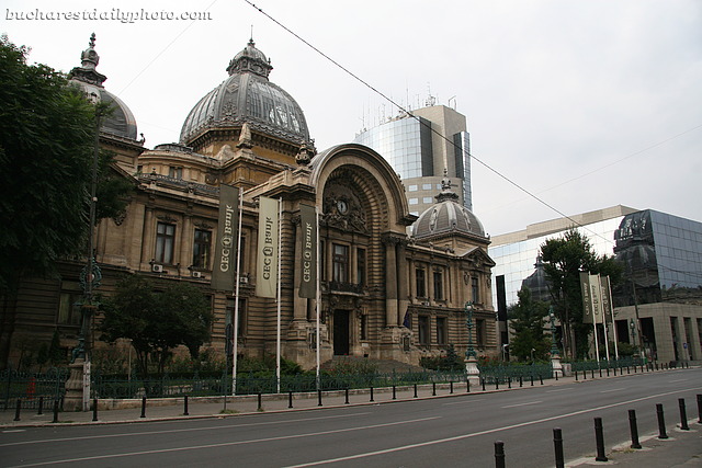
Yesterday was Theme Day at the City Daily Blog community, a monthly event that happens the first day of every month, when all participating blogs are posting a picture that relates to the theme day’s description. Just fresh back from vacation, and half asleep for half of the day, I completely forgot about it 🙁 So I decided to post a theme photo today. The theme for this month was “Contrast” and I’ve seen people interpreted it in different ways. Contrast in colors, contrast in sizes, old versus new etc. My picture for today shows old versus new architecture. We have here two banks: the old one, the “Romanian Savings Bank:”, was designed in eclectic style by the French architect Paul Gottereau and raised between the years 1896-1900; the new one, in the background, named “Bucharest Financial Plaza”, designed by Ruxandra Fotino and Sorin Ştefănescu, was built almost 100 years later, in 1994-1996, being the first tall building in the historic center.
Oct 022009

I have been there about 20 years ago, at that spot, gosh it looks quite different, I gues I will not be able to recoqnize Bucarest…
Wonderful belated THEME day photo which contrasts old and new architecture! Bravo!
This is the contrast I like, not only for Theme Days. These buildings do really go together well: the first could really be in Paris, please show us more of the modern building.
A wonderful picture of greatly contrasting architecture! Now I see why Bucharest is often called "Paris of the East".